
Cheongsong Global Co., Ltd.
Cheongsong Global Co., Ltd.
Cheongsong Global Co., Ltd.
2025
2025
2025
F&B / Food Service
F&B / Food Service
Interview & Visual Brief
CI Design
BI Design
Package Design
Product Range Design System
CMF Direction
Artwork Finalization
Interview & Visual Brief
CI Design
BI Design
Package Design
Product Range Design System
CMF Direction
Artwork Finalization
Interview & Visual Brief
CI Design
BI Design
Package Design
Product Range Design System
CMF Direction
Artwork Finalization
Manmiga
Manmiga
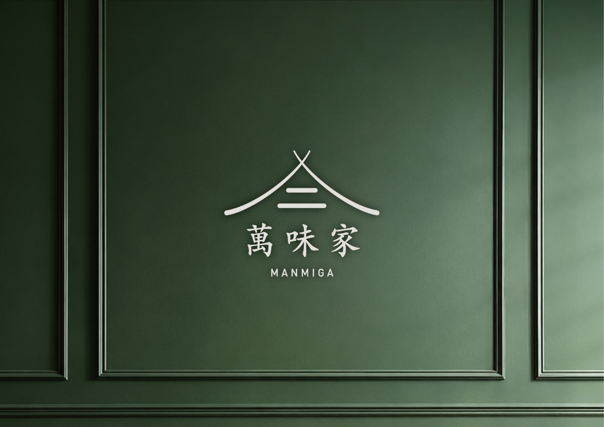


Manmiga(萬味家) is a food ingredient supply brand that provides Chinese cuisine-based ingredients to restaurants and foodservice businesses. This project went beyond designing a logo, focusing instead on establishing a clear visual direction for how the brand would be recognized in the market.
The core brand image was built around trust, clarity, and expertise in food ingredients. Based on this direction, we combined a Chinese character wordmark with a roof-inspired symbol to create an identity that reflects both the traditional character of Chinese food culture and the reliability of a professional supply brand. A deep green and burgundy color palette was used to create a calm yet distinctive brand mood, balancing the practical nature of a supply business with a refined visual presence.
The identity was then expanded into a pouch packaging system. For products such as frozen tofu skin, bean curd stick, flat potato glass noodles, and tofu sheets, each package was designed with a distinct color and structured information hierarchy according to the product’s characteristics. Transparent areas were incorporated to reveal the actual form and texture of the ingredients, allowing the product quality and usage to be communicated intuitively. Logo placement, product naming, usage icons, and graphic layout were systemized to ensure that the products could be recognized as part of one cohesive brand, whether displayed together or supplied across different foodservice environments.
만미가(萬味家)는 중식 식재료를 식당에 공급하는 식자재 납품 브랜드입니다. 이번 작업은 단순한 로고 제작을 넘어, 만미가라는 브랜드가 앞으로 어떤 인상으로 인식될지에 대한 시각적 방향을 새롭게 만드는 과정으로 진행했습니다.
브랜드의 핵심 이미지는 신뢰감, 정돈감, 식재료 전문성에 두었습니다. 이를 바탕으로 한자 로고타입과 지붕 형태의 심볼을 결합해, 중식 식재료 브랜드에 어울리는 전통적인 분위기와 안정적인 공급 브랜드의 이미지를 함께 표현했습니다. 딥 그린과 버건디 컬러를 중심으로 차분하면서도 깊이 있는 브랜드 무드를 구성해, 납품 업체의 실용성과 브랜드로서의 완성도가 함께 느껴지도록 설계했습니다.
이후 로고 아이덴티티를 파우치 패키지까지 확장했습니다. 냉동 두부피, 빈 커드 스틱, 감자당면, 두부포 등 제품별 특성에 따라 컬러와 정보 구조를 나누고, 제품이 직접 보이는 패키지 구성을 통해 식재료의 형태와 사용감을 직관적으로 전달했습니다. 여러 제품이 함께 진열되거나 납품될 때에도 하나의 브랜드로 인식될 수 있도록, 로고 위치와 제품명 체계, 사용 아이콘, 그래픽 레이아웃을 일관된 시스템으로 정리했습니다.
Manmiga(萬味家) is a food ingredient supply brand that provides Chinese cuisine-based ingredients to restaurants and foodservice businesses. This project went beyond designing a logo, focusing instead on establishing a clear visual direction for how the brand would be recognized in the market.
The core brand image was built around trust, clarity, and expertise in food ingredients. Based on this direction, we combined a Chinese character wordmark with a roof-inspired symbol to create an identity that reflects both the traditional character of Chinese food culture and the reliability of a professional supply brand. A deep green and burgundy color palette was used to create a calm yet distinctive brand mood, balancing the practical nature of a supply business with a refined visual presence.
The identity was then expanded into a pouch packaging system. For products such as frozen tofu skin, bean curd stick, flat potato glass noodles, and tofu sheets, each package was designed with a distinct color and structured information hierarchy according to the product’s characteristics. Transparent areas were incorporated to reveal the actual form and texture of the ingredients, allowing the product quality and usage to be communicated intuitively. Logo placement, product naming, usage icons, and graphic layout were systemized to ensure that the products could be recognized as part of one cohesive brand, whether displayed together or supplied across different foodservice environments.
만미가(萬味家)는 중식 식재료를 식당에 공급하는 식자재 납품 브랜드입니다. 이번 작업은 단순한 로고 제작을 넘어, 만미가라는 브랜드가 앞으로 어떤 인상으로 인식될지에 대한 시각적 방향을 새롭게 만드는 과정으로 진행했습니다.
브랜드의 핵심 이미지는 신뢰감, 정돈감, 식재료 전문성에 두었습니다. 이를 바탕으로 한자 로고타입과 지붕 형태의 심볼을 결합해, 중식 식재료 브랜드에 어울리는 전통적인 분위기와 안정적인 공급 브랜드의 이미지를 함께 표현했습니다. 딥 그린과 버건디 컬러를 중심으로 차분하면서도 깊이 있는 브랜드 무드를 구성해, 납품 업체의 실용성과 브랜드로서의 완성도가 함께 느껴지도록 설계했습니다.
이후 로고 아이덴티티를 파우치 패키지까지 확장했습니다. 냉동 두부피, 빈 커드 스틱, 감자당면, 두부포 등 제품별 특성에 따라 컬러와 정보 구조를 나누고, 제품이 직접 보이는 패키지 구성을 통해 식재료의 형태와 사용감을 직관적으로 전달했습니다. 여러 제품이 함께 진열되거나 납품될 때에도 하나의 브랜드로 인식될 수 있도록, 로고 위치와 제품명 체계, 사용 아이콘, 그래픽 레이아웃을 일관된 시스템으로 정리했습니다.


