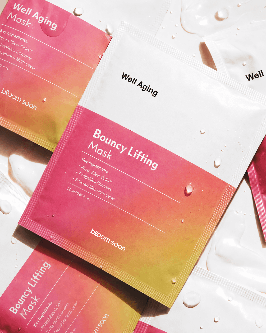
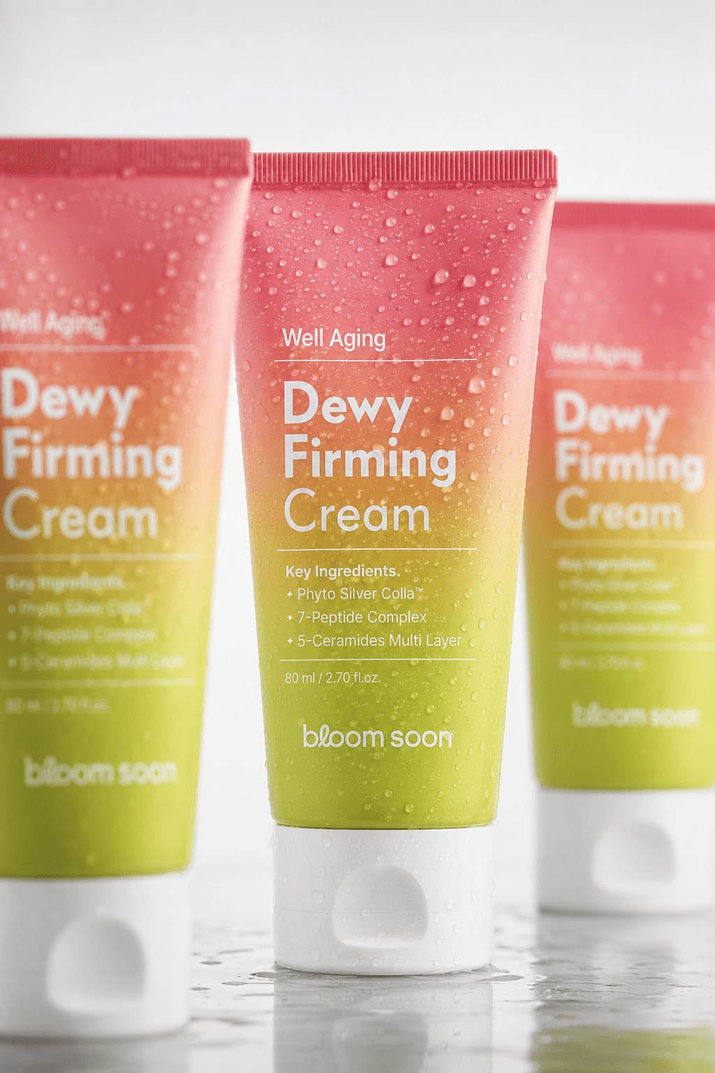
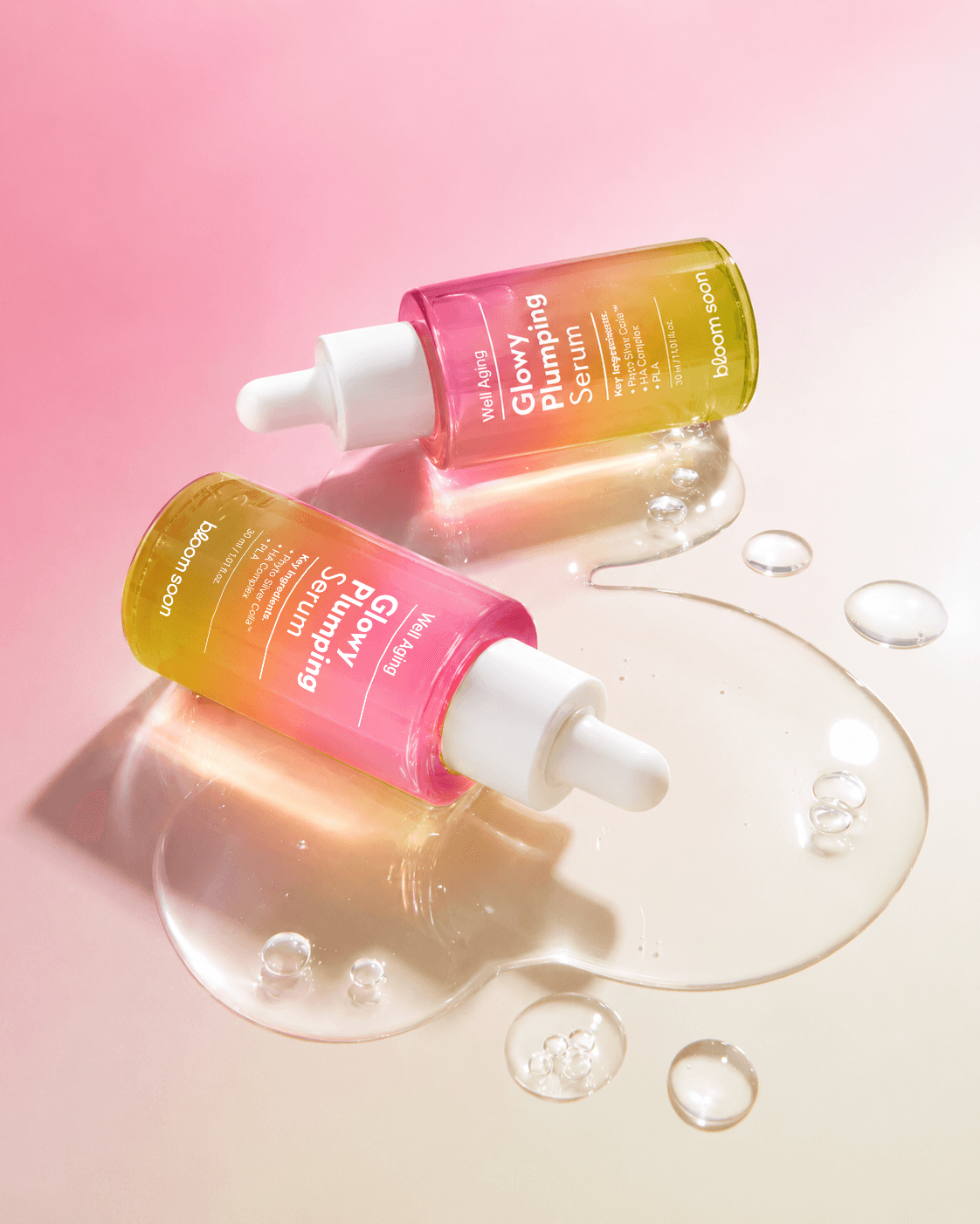
Bloom Soon is a skincare brand built around the philosophy of slow aging, proposing a healthy and natural skin routine. Starting from the early visual development stage of the brand launch, the project translated the blooming imagery behind the name ‘Bloom Soon’ and its Well Aging philosophy into the logo and packaging system. The soft pink-to-green gradient, refined graphic structure, and consistent information hierarchy help preserve the brand’s delicate impression across accessible retail environments. Together with the product lineup and CMF direction for each packaging component, the design establishes a cohesive visual foundation for the brand’s future expansion.
Bloom Soon(블룸순)은 건강하게 나이들어 가는 슬로우 에이징을 바탕으로 건강하고 자연스러운 피부 루틴을 제안하는 스킨케어 브랜드입니다. 브랜드 런칭 초기의 시각 개발 단계부터 함께하며, ‘Bloom Soon’이라는 이름이 가진 피어나는 이미지와 Well Aging 철학을 로고와 패키지에 시각화했습니다. 부드러운 핑크와 그린이 이어지는 그라데이션, 정돈된 그래픽 구조, 일관된 정보 위계를 통해 대중적인 유통 환경에서도 브랜드의 섬세한 인상이 유지될 수 있도록 설계했습니다. 제품 라인업과 부자재별 CMF 방향을 함께 구성해, 런칭 이후에도 하나의 시각 체계 안에서 브랜드가 자연스럽게 확장될 수 있는 기반을 마련했습니다.